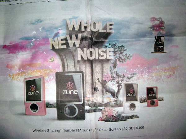
I was minding my own business today reading the NYTimes, when all of a sudden, in the center fold double-page spread, was a bizarro ad for Microsoft’s Zune.
My first thought was that this was pretty cheeky, a full-color double-page abortion the day after Apple announces its new iPod lineup. But then I began to look at the thing carefully.
Here it is:

You will notice the creases. Yes, I had to take a photo of it. When I went to find the online ad, it didn’t exist.
One would think that after all these years of Microsoft displaying absolutely no, and by “absolutely no” I mean none at [insert explicative of choice] all, design sense, I would be inured to such horrors. After all, this is the company that parodied itself with deadly and hilarious accuracy, and still didn’t learn. (And when they don’t parody themselves, others are more than willing to do it for them.)
Look at the thing. About the only mistake they didn’t make was to include the brown one. My mind is bending in painful shapes trying to get a toehold on how to explicate this thing.
Okay, it’s some kind of foul garden with noisome zuneplants popping up. But what’s with the concrete/sandstone monstrosity in the middle? (Photoshop hint: just because you can add textures doesn’t mean you should.) They’re shaped like periscopes of some kind. Why?
And what does WHOLE NEW NOISE mean? It doesn’t even show up on the Zune’s official website.
This does, though:

This is the header in the News section. (I poked around a little bit to see if I could find the foul garden ad. I couldn’t. There was no mention of WHOLE NEW NOISE.)
I swear to God, all I thought of when I saw this was, “Sweet Jesus, the man bought a Zune and now the zombies are going to get him! Squirt, man, for the love of God, squirt!”
Back to the ad.
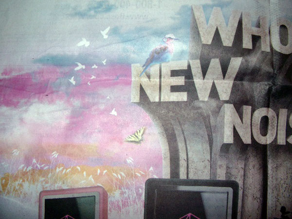
One starts to notice details:

What’s with the swallowtail, and is that a passenger pigeon?? Meanwhile, behind the masked-out wheat field, masked-out birds flee into the garishly rising sun.
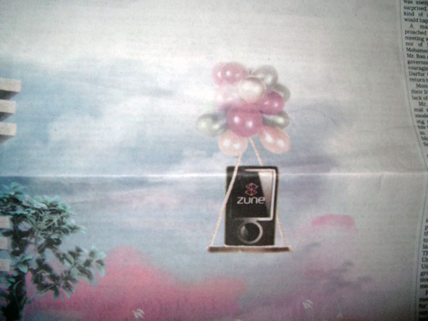
Over on the other side…

…a Zune (maybe that’s the brown one) is being airlifted out of there by a rather cancerous-looking bunch of balloons. Or maybe it’s arriving. The narrative is hard to discern here. One thing’s for sure, the Zune sure can balance: there are only two rope/string/twine thingies suspending the platform on which it sits.
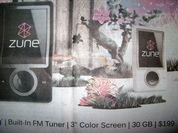
Finally, one’s eye is drawn to the center:

The lone bonsai in the middle sports a pinwheel. Um… OK.
The rest of the flora? Three fungi, and are they not poisonous ones?, and what looks to be a bromeliad, a comfy kind of houseplant, to be sure.
The jaws gape and the brows furrow. What is this about? What is anyone supposed to read into this feckless attempt at whatever this is an attempt at?
My contempt for poor Microsoft is well known, of course, but heavens to betsy, this is just plain incompetent, even for them. WHOLE NEW NOISE? In what way? The Zune is not a new product, nor are these new models. Apple introduced new models, Bill, not you. (Apple’s also about to release yet another update to its operating system, Bill.)
Has anyone seen any TV ads tying into this WHOLE NEW NOISE/Rappaccini’s garden motif? Can you imagine Apple running a print ad like this? And then not coordinating it with the website? No, of course you can’t.
Ah! Here it is! http://www.zune.net/en-US/meetzune/ — “pink, black, white, red and–are you ready– BROWN!
Apparently it takes Microsoft a day or two to get its website aligned with new advertising blitzes, if that’s the word we want to use here.
Here’s the Zune site, and here’s a fanboy’s “finding” of the Flash animated version.
It’s no better. We were right about the brown one being airlifted in (and it is in). The whole thing looks as if it were put together by said fanboy on his Dell box.
Further reflections, so to speak: the lighting on the five Zunes is not aligned. It looks like they created one, then just changed the color and re-angled the other four without considering how the reflections would change thereby. And the lighting of the Zunes has nothing to do with the rest of the illustration. I was going to say background, but the icky plants bring the scene forward into the Zune space.
It gets worse: with the two Zunes on the left, the highlights on the clickwheel are about 80° off from each other, even though they seem to be pretty closely aligned. But then the white one and the pink one, which are arranged perpendicularly, have the same highlight.
Every corner of this thing is just infested with incompetence. It’s almost as if someone realized last week that Apple was about to dominate the airwaves, again, and they needed to get a new message out there pronto. Like two days from now.
Bless their hearts.