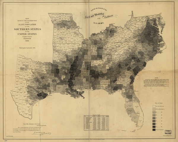
The other day there was a tweet that led to an article about THE MAP THAT CONVINCED LINCOLN TO FREE THE SLAVES, and even without clicking on the link I knew what map they were talking about:

I had stumbled across this map in the Library of Congress’s online files several years ago, and I used it to develop a lesson for 5th graders on how to read primary source documents.
For the lesson, I came up with the following chart:
Levels of Understanding Primary Source Documents
| I. | Literal level | What is this document? What does it say? What do the words mean? |
| II. | Connections level | What is the historical context of this document? What other documents/events/ideas are connected to it? |
| III. | Meanings level | Why did this document exist? Who created it and why? What is its meaning? What was its meaning to those who created it? |
| IV. | Interpretations level | Can I create a product of my own that comes from the same literal/connections/meanings as the document? |
I printed up enough copies of the map for every two students to have one; I had a large format printer, so they got something close to the original size. Then we started.
I. Literal level
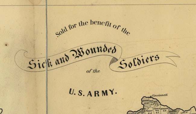
We read the words on the map and talked about what the map was. We looked at the date of publication (1861). We looked at the text at the top:

We looked at the scale:

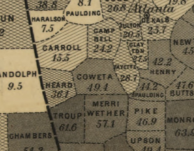
We found Coweta County on the map:

We talked about the number in Coweta County: 49.4% of the county’s population was slaves.
We discussed what the Census was.
I remember asking them whether it looked as if the slave population were evenly distributed across the south, and they were quick to say no. When I asked if they could explain the patterns of light and dark, they immediately told me that it was pretty clear that the heaviest slave populations were where cotton and rice were grown, i.e., plantations. I was impressed.
II. Connections level
Next I asked them to tell me what they knew about the U.S. in 1861: the nation was at war, the Confederacy vs. the Union. The Union was not doing well in battle; the war was not popular. Abraham Lincoln was President. The South was largely rural/agricultural, and much of that was supported by slavery.
I showed them Article I, Section 2, Clause 3 of the Constitution:
Representatives and direct Taxes shall be apportioned among the several States which may be included within this Union, according to their respective Numbers, which shall be determined by adding to the whole Number of free Persons, including those bound to Service for a Term of Years, and excluding Indians not taxed, three fifths of all other Persons.
We talked about the 3/5s Compromise and what that meant. I directed them to the computers — I ran a 21st century media center — where I had prepared a HyperCard stack for them to use the census data to calculate how many congressional representatives each southern state got based on their free populations as well as “all other Persons.” (We discovered that the southern states gained an extra 25 representatives based on a population who could not vote and who were not actually citizens.)
III. Meanings level
The crux of the matter: why did this map exist?
Part of the answer is the piece at the top about the map being sold to support the sick and wounded soldiers of the U.S. — it was an appeal to patriotism, underscored by the title of the map: this was a map of the southern states of the United States. (Confederate States of America? Pfft.)
And by linking the reminder of sick and wounded soldiers to the southern states, the map was driving home the point of the war: the southern states had seceded to protect their Peculiar Institution, an institution that had given them an unfair advantage in Congress since the drafting of the Constitution 75 years before.
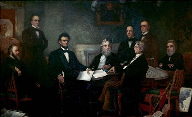
Indeed, and I didn’t know this at the time of this lesson, Lincoln had used this map in his deliberations about the war and the Emancipation Proclamation, so much so that it was included in this painting of the “First Reading of the Emancipation Proclamation”:

IV. Interpretations level
Students were then given the following assignment:
Buy This Map!
Your task is to persuade a friend to buy one of these maps. You are a young person living in Philadelphia in 1861, and one morning in October you happen to be walking by H. Long & Brother Booksellers when you notice this map in the window. You immediately realize what the maps have to say about the reasons for the war, and you go in and buy one to support the war effort.
Now you want all your friends to buy one, too.
Write a letter to your friends to convince them of all the reasons they need to buy one of these maps. Instead of writing a letter, you may give a speech.
A good letter/speech will
• explain what the map tells you [Level I]
• explain the reasons for the war shown in the map [Level II]
• explain the connection between the Constitution’s “3⁄5 rule” and the map [Level II]
• explain what good the money will do [Level I]
• explain how the map made you feel and why you bought it [Level III]
Use the front and back of the next page to write your letter or to organize the notes for your speech.
Results were varied, as you might imagine; this is not an easy assignment, to translate all the things we learned into a personal narrative. But it’s the kind of assignment that schools should have been doing and should be doing: it’s not just a creative writing exercise, it’s an assessment. The student demonstrates what he/she understands about the map in a rather complete way. Yes, I had an objective test that I gave students as well, but that was just a formative assessment to double-check their knowledge/understanding before they wrote the letter. Yes, the lesson took longer and was more involved than simply standing in front of a class and telling them what the map meant. But it allowed the learners to construct knowledge, and in my charter school that will be the name of the game.
By the way, this is what my 21st century media center looked like:

UPDATE: Since there’s been some interest in this post, I thought I should circle back and include the “checbric” we gave the students. (“Checbric” is one of those ugly coined terms from back in the day, a combination of “checklist” and “rubric.”)
Descriptions
Your letter/speech describes
____ when and where you bought the map
____ why you bought the map
____ why your friend (the reader) should buy the map
Descriptions
5 You’ve made the reader believe that this a real letter from a real person in 1861. You are utterly convincing with your reasons and personal details.
4 Your descriptions are often and sharp and complete, giving the reader details that make the letter come alive.
3 Your descriptions have enough details that the reader has no problem understanding who wrote this letter and why. Your arguments are convincing.
2 Your descriptions allow the reader to see that a person has written this letter, but there are not enough details for the reader to get an idea of who you are, and you don’t really convince the reader to buy a map.
1 Your descriptions are missing. The reader can’t tell who you are or what your reasons are for writing the letter.
Explanations
Your letter/speech contains an explanation of
____ what the map tells you
____ the reasons for the war shown on the map
____ the connection between the 3/5 rule and the map
Explanations
5 Your explanations are unusually thorough and inventive. They are fully supported and justified by evidence. They go beyond the information given in class.
4 You explanations are revealing and thorough. They are well-supported by evidence. You make subtle connections that we didn’t talk about in class.
3 Your explanations give some in-depth or personal ideas. You make the lesson your own, but you don’t use enough evidence to back up your explanations completely.
2 Your explanations were incomplete, even though you used some of what we learned. Your explanations only had limited evidence.
1 Your explanations are more descriptive than analytical. You give only a fragmentary or sketchy account of the facts.